HICO Solutions

Context
HICO Solutions helps Cameroonian, and more broadly African, businesses source products from China: finding reliable suppliers, quality control, logistics. The founder, based between Yaoundé and Shanghai, needed an identity that inspires trust at first glance, before the first exchange even happens.
Problem
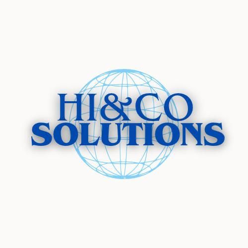
Before Michel's involvement, HICO Solutions carried a "HI&CO Solutions" logo: a generic blue wireframe globe and a classic serif wordmark, the exact visual toolkit shared by hundreds of sourcing firms worldwide. Nothing in that mark said who was behind the company, or where it spoke to the world from. In a sector where trust is earned before the first exchange, an interchangeable identity convinces no one.
Concept
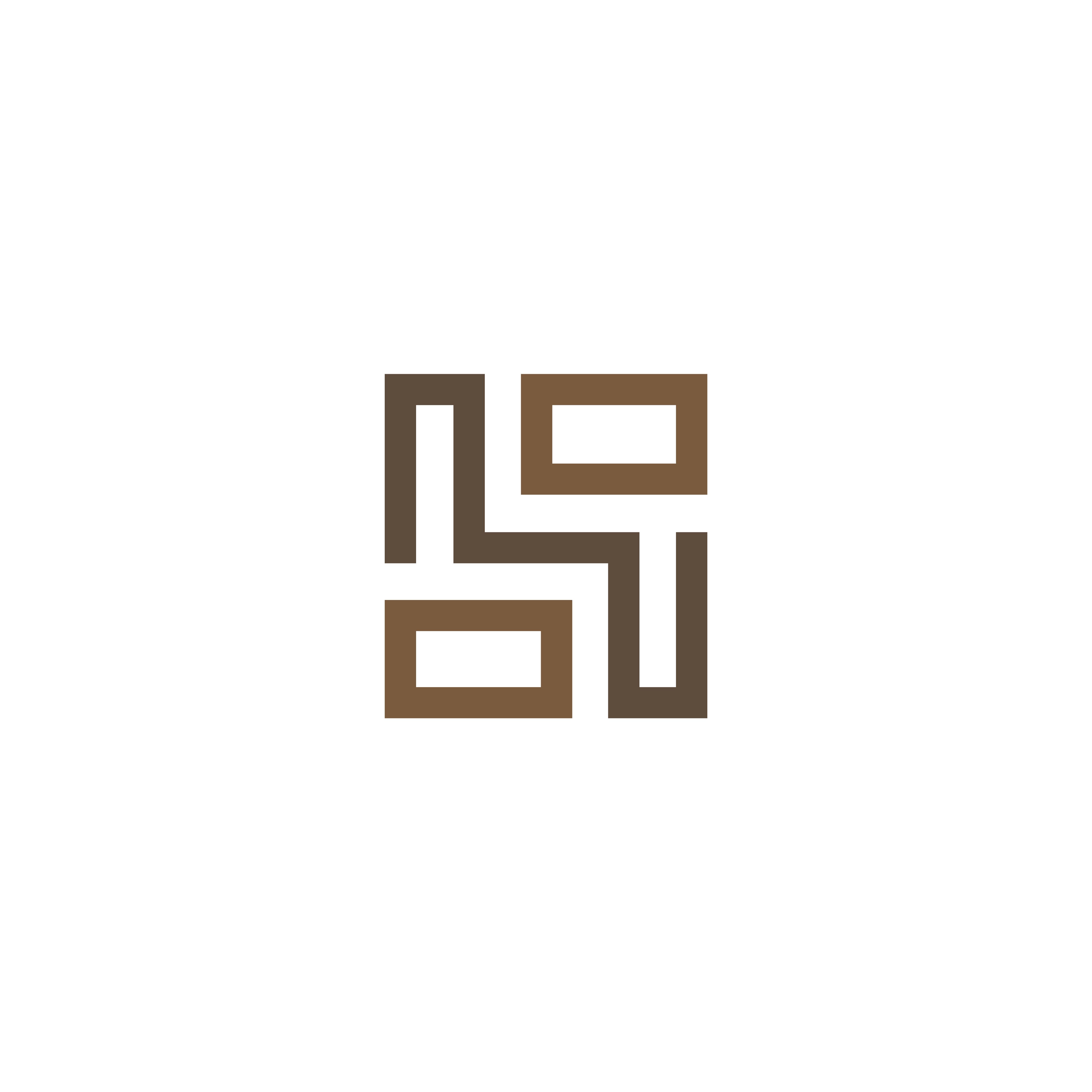
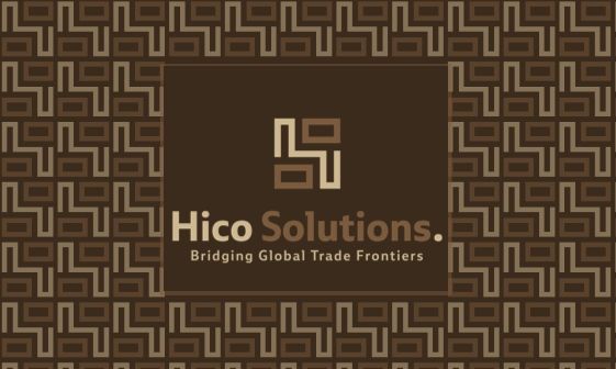
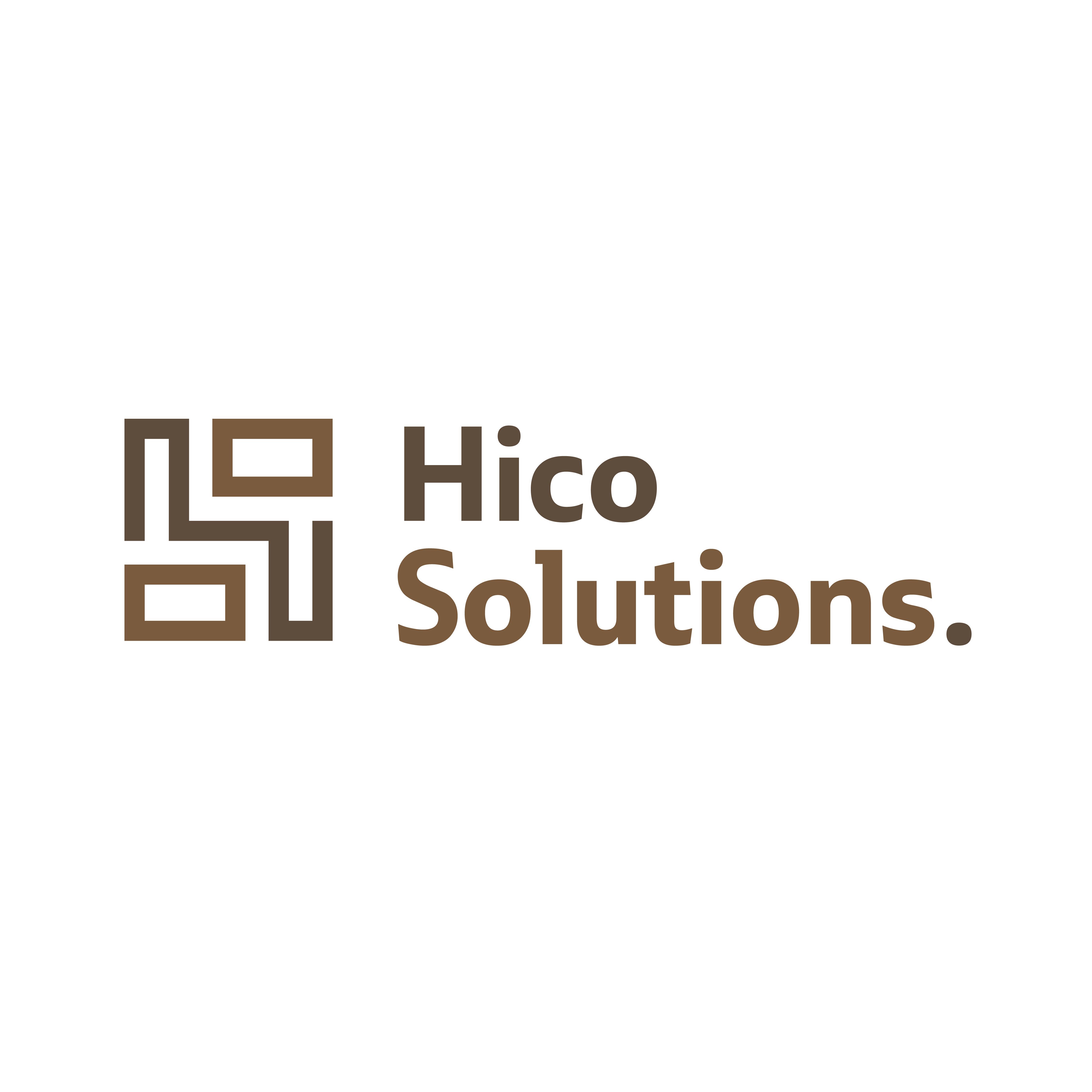
An identity that refuses the sector's generic codes (corporate blue, stock globe, institutional serif). In their place, a monogram that evokes an ancient African symbol, carrying balance and stability, exactly the qualities one looks for in a trade partner. The promise is stated plainly in the tagline: "Bridging Global Trade Frontiers."
Cultural anchor
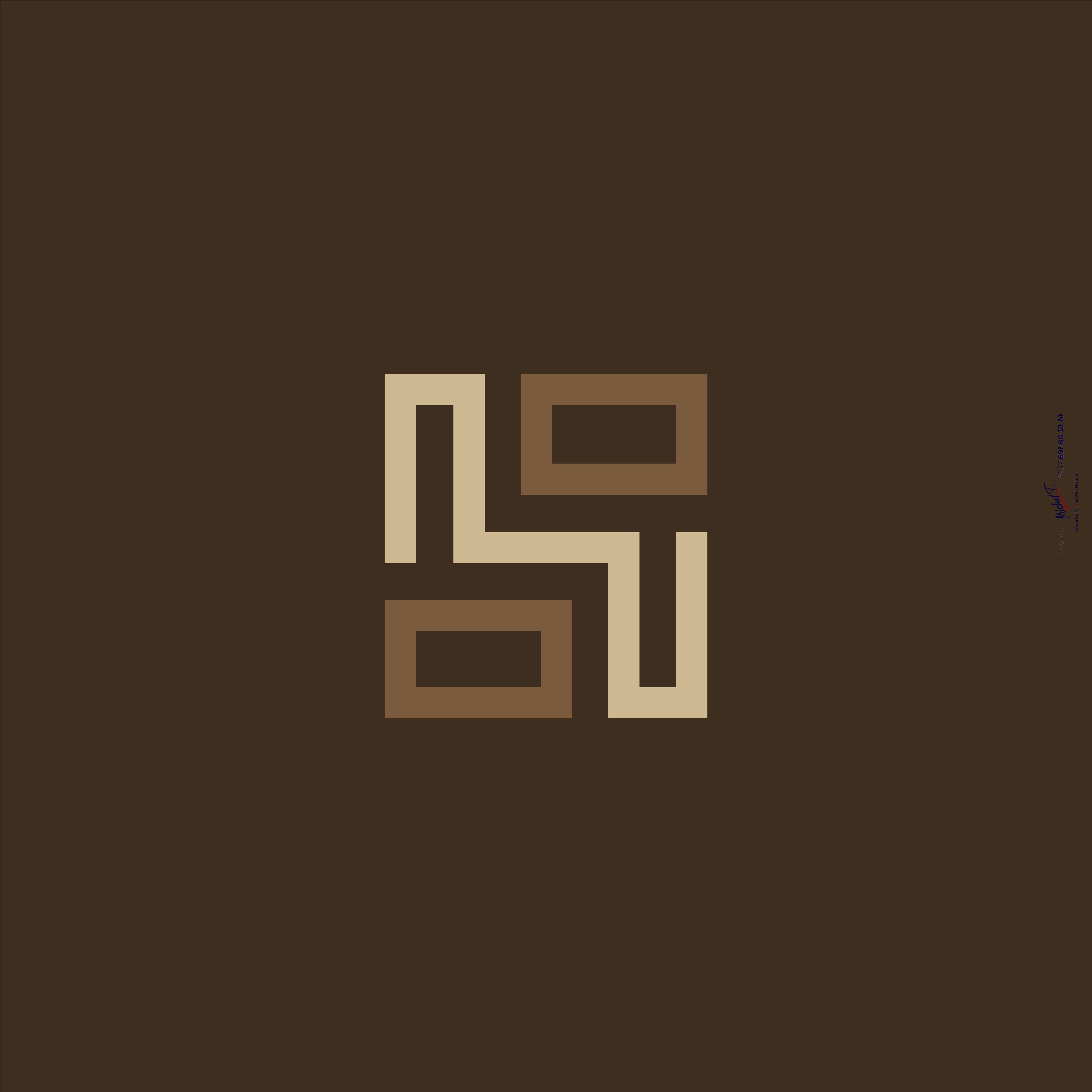
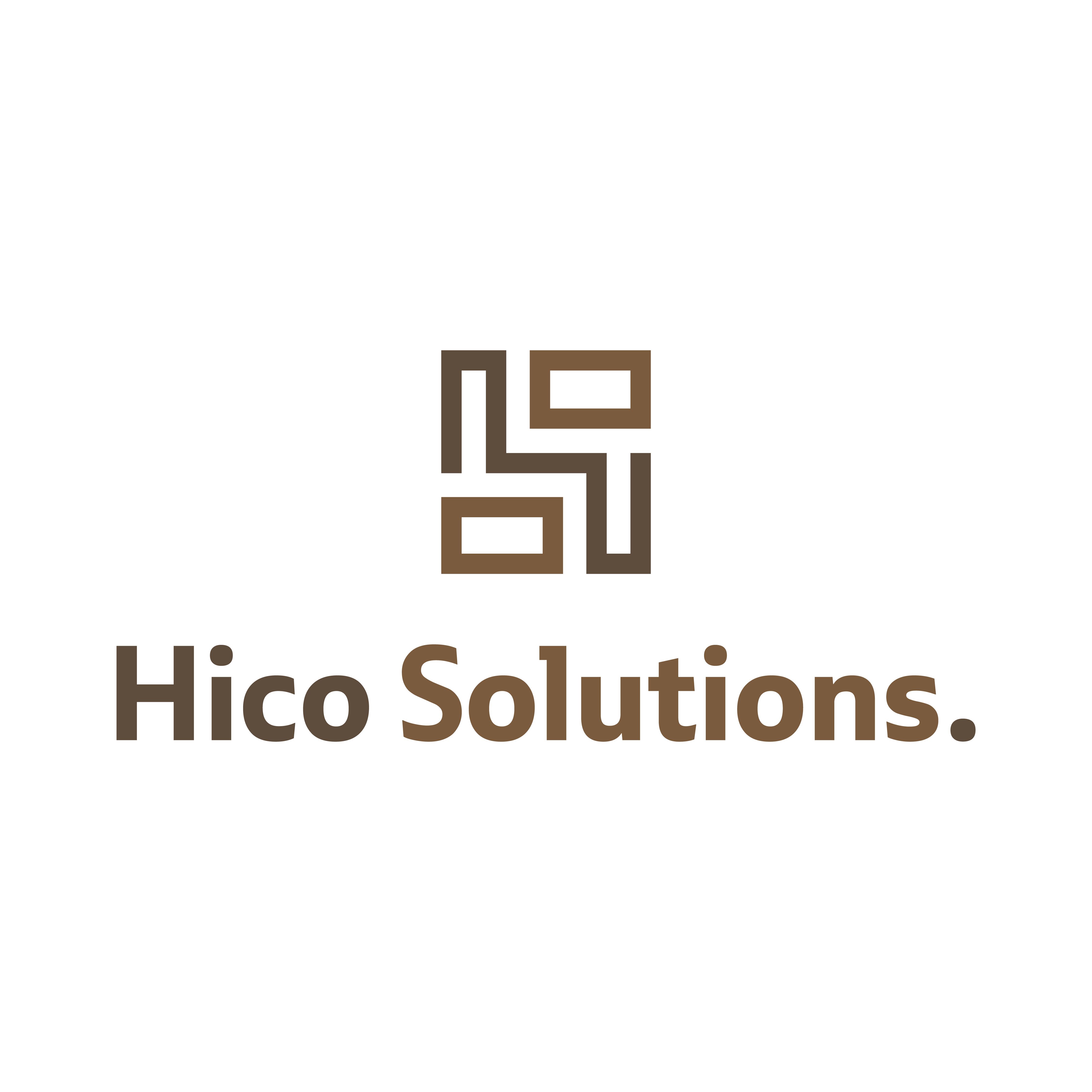
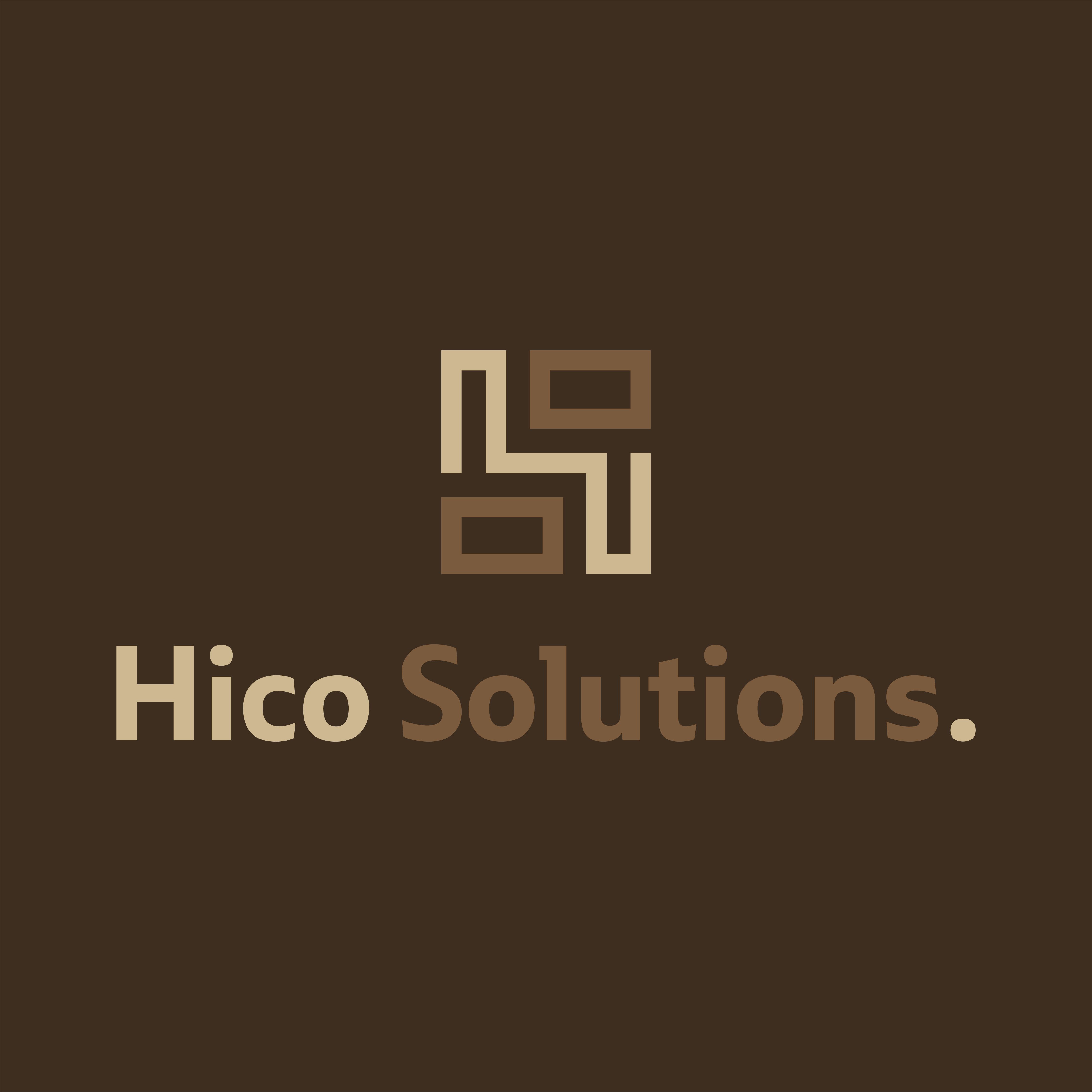
The icon pairs an "H" and an "S" in a minimal, balanced, stable form that evokes an ancient African symbol. The typeface, Ebony, was chosen for its very name: a wood species typical of Africa, while staying modern and timeless. Letters stay lowercase with capitals leading each word, a choice meant to stay approachable, while keeping the height that carries professionalism. The palette, shades of brown and beige, recalls the earth and a rootedness in African heritage, and speaks quietly to eco-responsibility.
Process
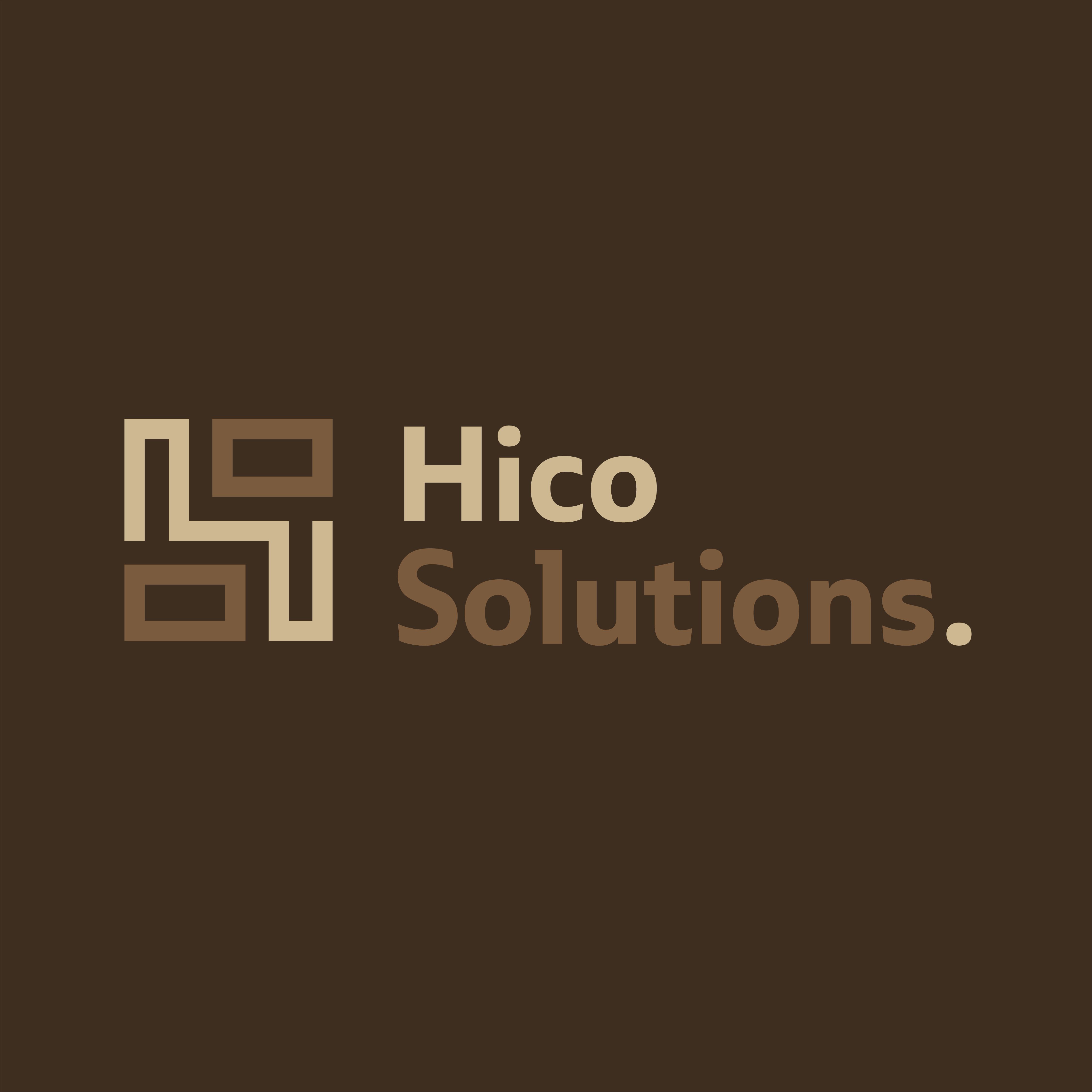
The monogram alone and the full logotype, in horizontal and vertical layouts, light and dark versions. The palette: dark brown #5E4C3C, light brown #7B5B3D, light beige #CDB891. The Ebony typeface, three weights.
System
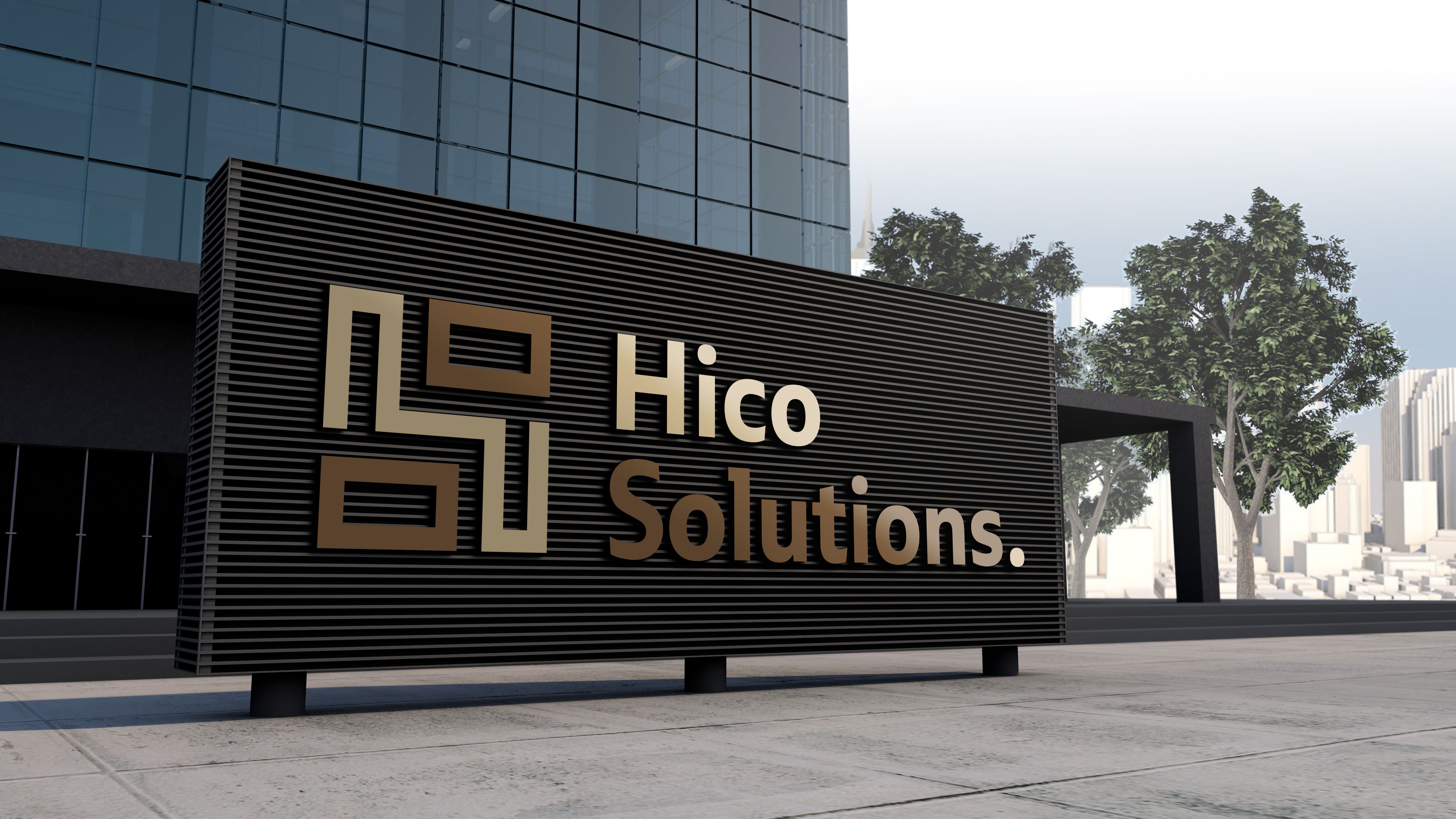
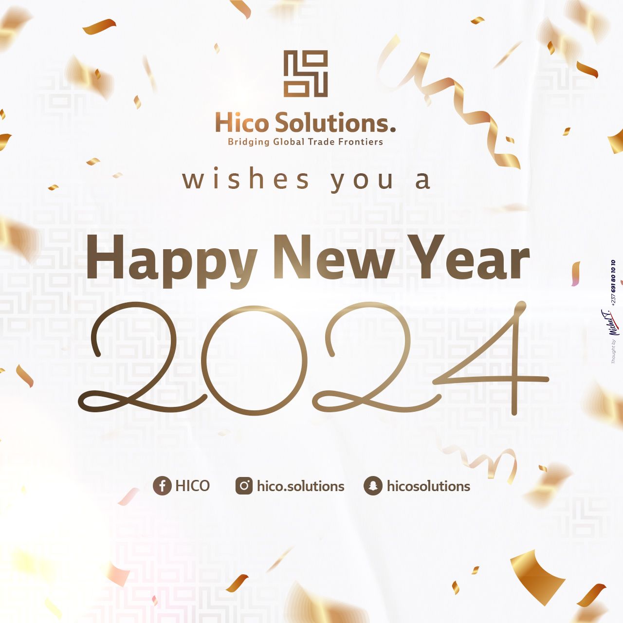
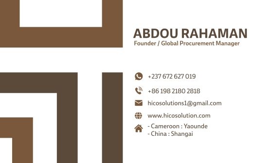
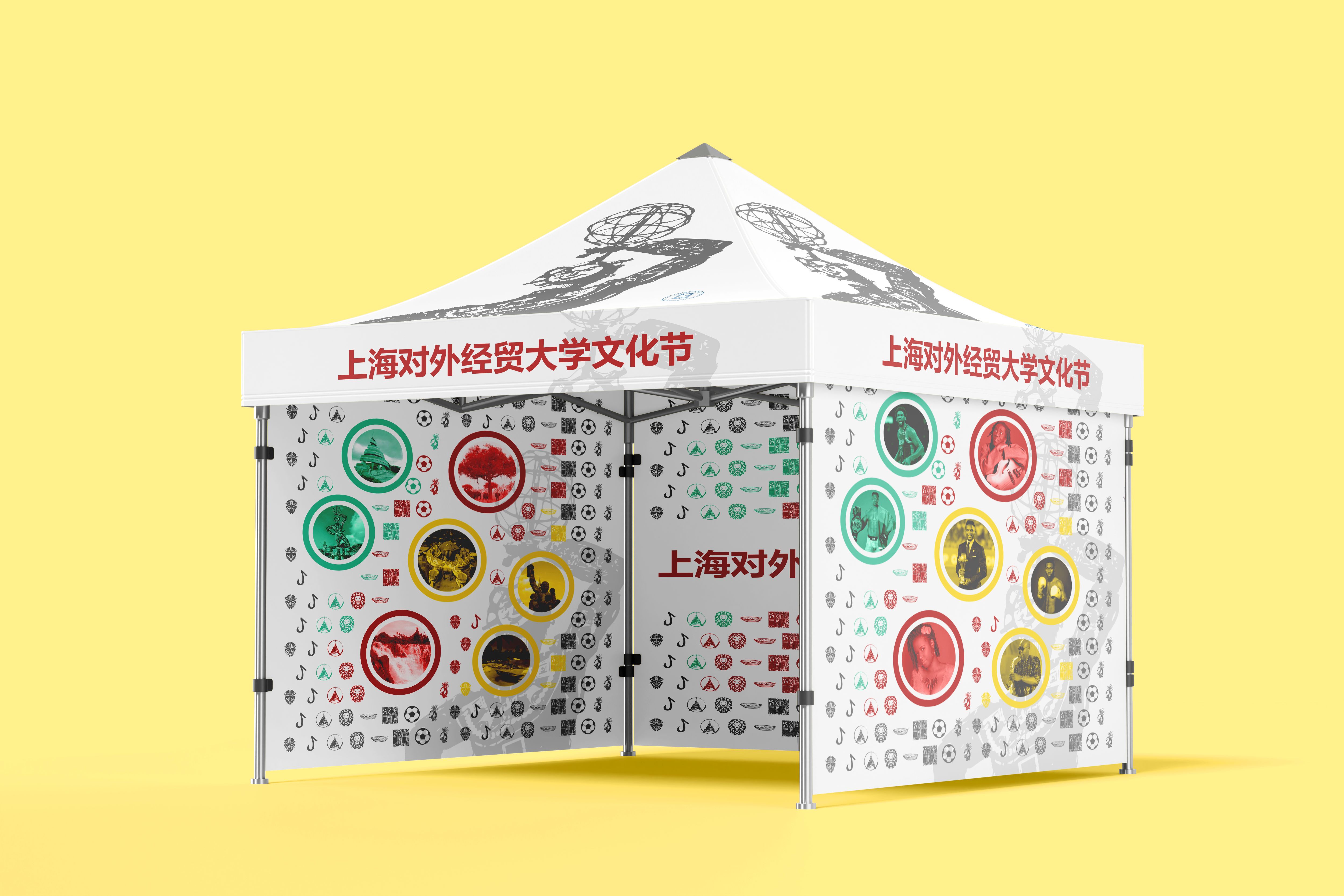
Applications: business card, building signage, bilingual FR/EN banners, a social media campaign (New Year greetings), a trade fair booth. One striking, singular staging: the icon carved in relief into a plastered wall, raking light, rather than a flat mockup.

Before / After
Result
From total anonymity to an identity no one else could claim. The generic wireframe globe and the borrowed serif gave way to a monogram that alone carries an ancient African symbol, a typeface named for its roots, a palette that speaks of earth and heritage. HICO Solutions went from a brand indistinguishable from any competitor to one recognized at a glance, one that states from the first look where it speaks from.